YUNO
BRAND SYSTEM | PACKAGING | CAMPAIGN | AI PROTOTYPING | DIGITAL
YUNO is a modern wellness brand built around a dissolvable strip format, reimagining supplementation as something intuitive, architectural, and designed to live in sight.
The project spans brand strategy, identity, packaging design, campaign development, and web art direction, building a cohesive system from insight to execution.
Generative AI was integrated as a structured prototyping tool to explore visual systems, color universes, and scalable campaign environments before final art direction was locked.
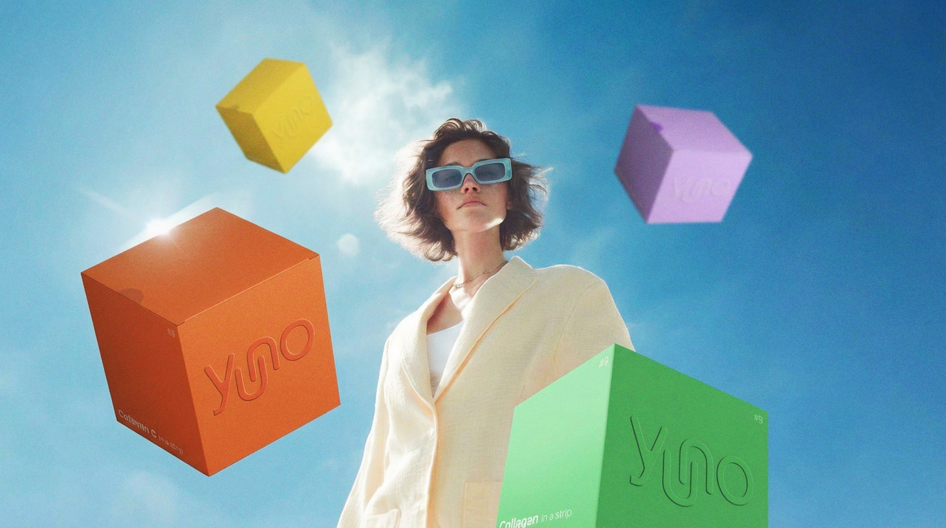
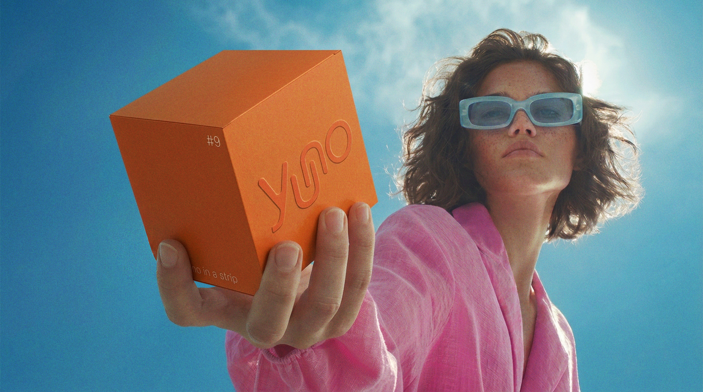
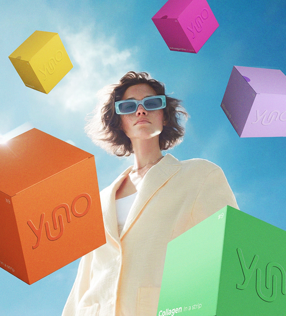
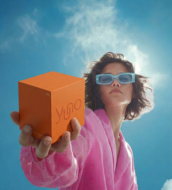
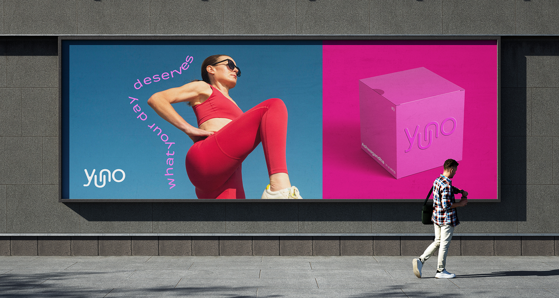
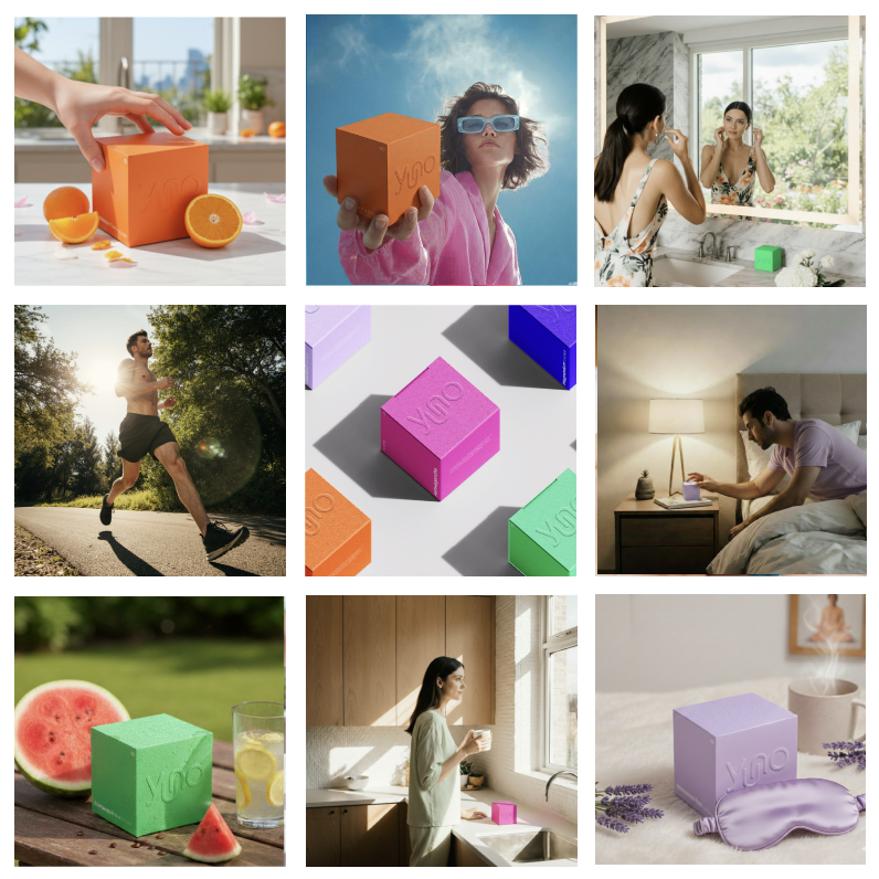
Campaign Direction
The campaign translates the identity into a clean, expressive visual world.
Shot from a low, slightly distorted point of view, the visuals place the viewer below the subject, giving the product a sense of presence and confidence. The cube acts as the anchor across all compositions — held, suspended, or floating — while consistently maintaining its structure.
Midjourney, Weavy, and Firefly were used as a controlled prototyping layer to explore camera angles, lighting, and spatial relationships. This allowed the visual language to evolve through iteration, with final compositions art directed to ensure consistency across all assets.
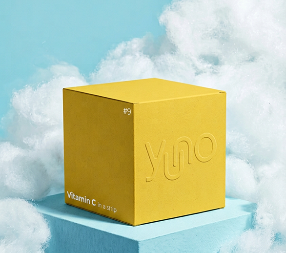
The Brand
YUNO is built on a simple idea: people already know what their bodies need — you know.
The brand reflects that confidence through clarity. Rather than instructing or overwhelming, it supports everyday moments — movement, focus, travel, rest — without adding noise.
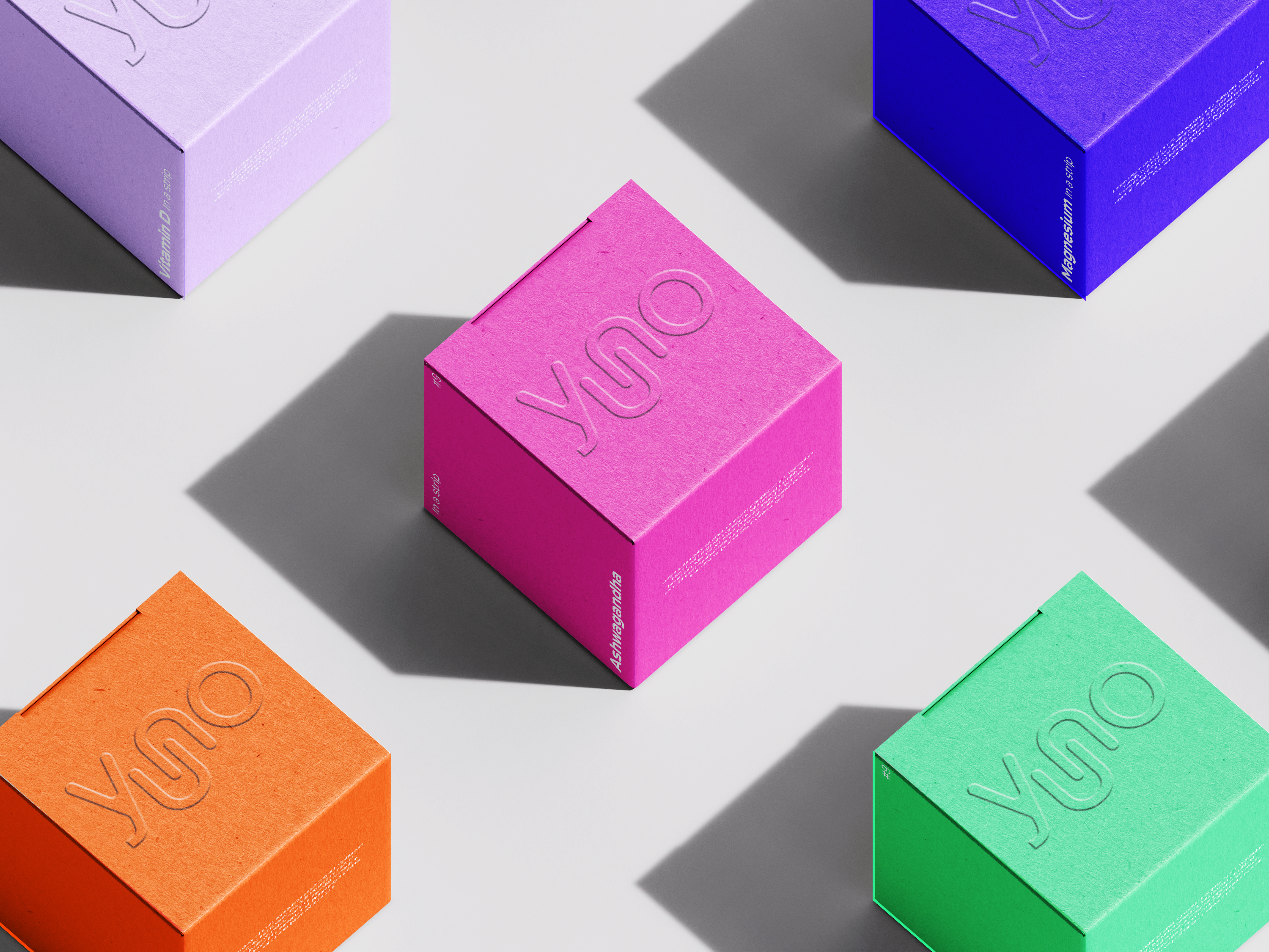
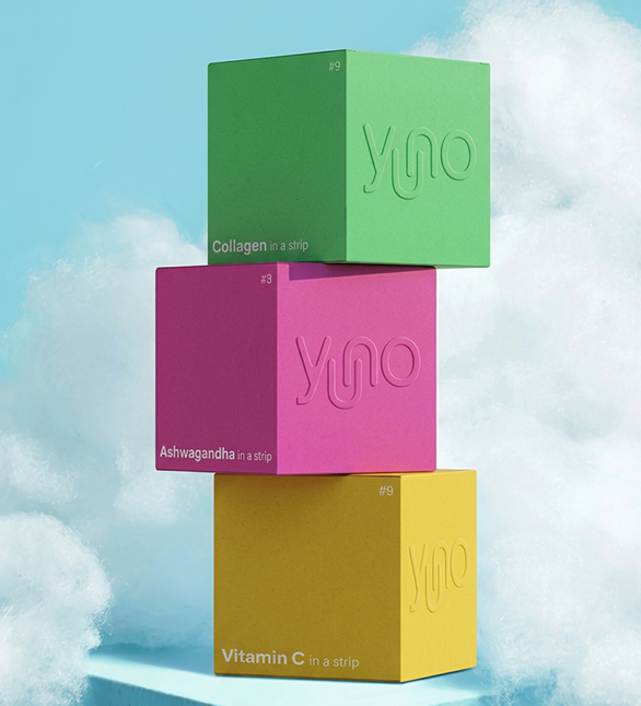
This thinking translates into a visual language that is both minimal and expressive. The cube becomes the central element, acting as packaging, structure, and compositional anchor.
The Challenge
Traditional supplements are bulky, clinical, and visually intrusive — designed to be stored away rather than lived with.
The challenge was to create a system that feels compact, clear, and confidently present, while remaining flexible enough to scale across different contexts.
The approach was to reduce the product to its essential form and build a modular system around it. Geometry, color, and composition were treated as structured elements rather than decoration, allowing the identity to expand without losing coherence.
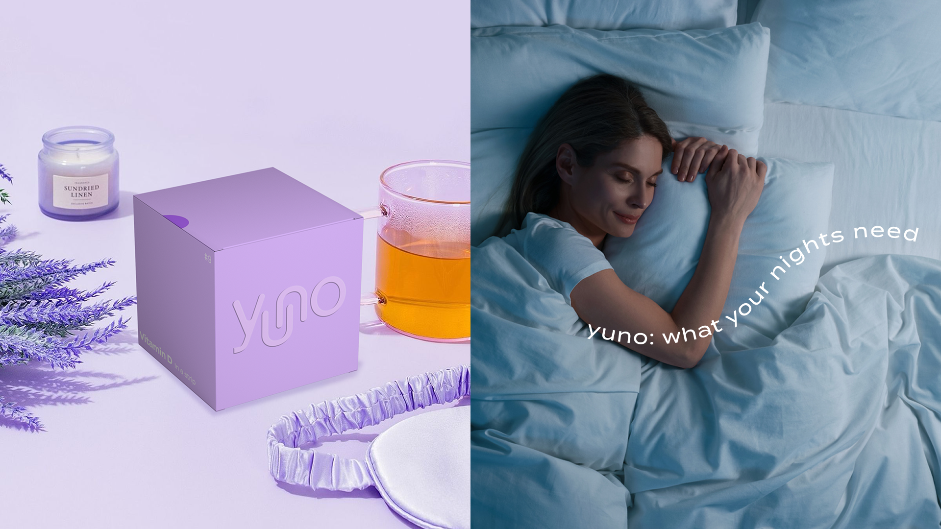
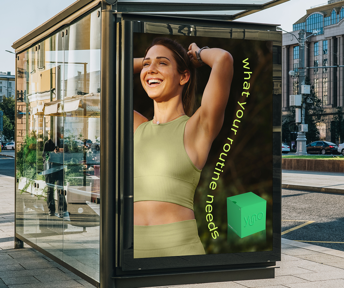
Content in Context
The brand extends into everyday environments, placing the product within moments of use — from movement to rest.
Generative tools enabled rapid exploration of these scenarios, supporting the development of a consistent yet scalable content system.
The Outcome
YUNO evolves from a visual identity into a complete campaign system, where branding and imagery are developed as one.
The result is a scalable visual language that maintains consistency, clarity, and product integrity across all outputs — from packaging to campaign assets.
Wellness is positioned not as something to correct, but as something to own.